Free Statistics

of Irreproducible Research!

Author's title

Author*The author of this computation has been verified*
R Software Modulerwasp_cloud.wasp
Title produced by softwareTrivariate Scatterplots
Date of computationMon, 10 Nov 2008 07:17:18 -0700
Cite this page as followsStatistical Computations at FreeStatistics.org, Office for Research Development and Education, URL https://freestatistics.org/blog/index.php?v=date/2008/Nov/10/t1226326714ui384e1m8gzc4e9.htm/, Retrieved Sun, 19 May 2024 05:47:56 +0000
Statistical Computations at FreeStatistics.org, Office for Research Development and Education, URL https://freestatistics.org/blog/index.php?pk=23078, Retrieved Sun, 19 May 2024 05:47:56 +0000
QR Codes:

Original text written by user:
IsPrivate?No (this computation is public)
User-defined keywords
Estimated Impact131
Family? (F = Feedback message, R = changed R code, M = changed R Module, P = changed Parameters, D = changed Data)
F       [Trivariate Scatterplots] [Trivariate scatte...] [2008-11-10 14:17:18] [b0654df83a8a0e1de3ceb7bf60f0d58f] [Current]
Feedback Forum
2008-11-20 23:12:13 [Olivier Uyttendaele] [reply
In dit model vind je 3 soorten grafieken, de kubussen, een matrix en bivariate density plots.
Bij de kubussen moet echter wel opletten bij de visuele interpretatie.

Zij geven ons een verkeerd beeld, er is niet echt een duidelijk patroon te zien. Dit is logisch aangezien het een 3D figuur betreft die op een 2D scherm wordt geprojecteerd. Je kan niet zien hoe de afstand tussen de punten zich verhoudt. De punten worden meer op 1 lijn geprojecteerd (2D scherm).
In de matrix daaronder krijg je dan een projectie van de kubussen (scatterplots), deze kunnen wederom een verkeerd beeld geven aangezien je nog een dimensie moet toevoegen. Op de hoofddiagonaal staan de histogrammen.
Uit de bovenstaande scatterplots wordt dan een bivariate Kernel density plot getekend.
Hier wordt wederom zoals bij Q1 gewerkt met hoogtelijnen die punten met een zelfde dichtheid gaan verbinden. Aangezien je hier duidelijk clusters kunt waarnemen, geeft dit plot meer en duidelijkere info dan een scatterplot & correlatie.
2008-11-23 14:16:00 [Thomas Baken] [reply
Ok de kubussen geven misschien een niet totaal correct beeld maar we kunnen toch bemerken indien we te maken hebben met correlatie of niet. Zo kunnen we in de eerste kubus een grotere correlatie opmerken dan in de tweede kubus.

Post a new message
Dataseries X:
217859
208679
213188
216234
213587
209465
204045
200237
203666
241476
260307
243324
244460
233575
237217
235243
230354
227184
221678
217142
219452
256446
265845
248624
241114
229245
231805
219277
219313
212610
214771
211142
211457
240048
240636
230580
208795
197922
194596
194581
185686
178106
172608
167302
168053
202300
202388
182516
173476
166444
171297
169701
164182
161914
159612
151001
158114
186530
187069
174330
Dataseries Y:
258778
252791
256389
258961
258647
256304
250498
247883
249552
262626
264416
273049
272441
267564
265952
263937
264765
263386
258985
257334
257477
271486
274488
281274
272674
269704
268227
276444
272247
268516
263406
263619
265905
281681
287413
289423
281242
273878
269022
272630
270287
260447
262248
252806
238663
258438
266719
263279
258064
248828
248284
253376
251846
239494
239709
228793
229521
249999
254016
251178
Dataseries Z:
88827
85874
85211
87130
88620
89563
89056
88542
89504
89428
86040
96240
94423
93028
92285
91685
94260
93858
92437
92980
92099
92803
88551
98334
98329
96455
97109
97687
98512
98673
96028
98014
95580
97838
97760
99913
97588
93942
93656
93365
92881
93120
91063
90930
91946
94624
95484
95862
95530
94574
94677
93845
91533
91214
90922
89563
89945
91850
92505
92437


Summary of computational transaction
Raw Inputview raw input (R code)
Raw Outputview raw output of R engine
Computing time2 seconds
R Server'Gwilym Jenkins' @ 72.249.127.135

\begin{tabular}{lllllllll}
\hline
Summary of computational transaction \tabularnewline
Raw Input & view raw input (R code)  \tabularnewline
Raw Output & view raw output of R engine  \tabularnewline
Computing time & 2 seconds \tabularnewline
R Server & 'Gwilym Jenkins' @ 72.249.127.135 \tabularnewline
\hline
\end{tabular}
%Source: https://freestatistics.org/blog/index.php?pk=23078&T=0

[TABLE]
[ROW][C]Summary of computational transaction[/C][/ROW]
[ROW][C]Raw Input[/C][C]view raw input (R code) [/C][/ROW]
[ROW][C]Raw Output[/C][C]view raw output of R engine [/C][/ROW]
[ROW][C]Computing time[/C][C]2 seconds[/C][/ROW]
[ROW][C]R Server[/C][C]'Gwilym Jenkins' @ 72.249.127.135[/C][/ROW]
[/TABLE]
Source: https://freestatistics.org/blog/index.php?pk=23078&T=0

Globally Unique Identifier (entire table): ba.freestatistics.org/blog/index.php?pk=23078&T=0

As an alternative you can also use a QR Code:  

The GUIDs for individual cells are displayed in the table below:

Summary of computational transaction
Raw Inputview raw input (R code)
Raw Outputview raw output of R engine
Computing time2 seconds
R Server'Gwilym Jenkins' @ 72.249.127.135


Parameters (Session):
par1 = 50 ; par2 = 50 ; par3 = Y ; par4 = Y ; par5 = Vlaams Gewest ; par6 = Waals Gewest ; par7 = Brussels hoofdstedelijk Gewest ;
Parameters (R input):
par1 = 50 ; par2 = 50 ; par3 = Y ; par4 = Y ; par5 = Vlaams Gewest ; par6 = Waals Gewest ; par7 = Brussels hoofdstedelijk Gewest ;
R code (references can be found in the software module):
x <- array(x,dim=c(length(x),1))
colnames(x) <- par5
y <- array(y,dim=c(length(y),1))
colnames(y) <- par6
z <- array(z,dim=c(length(z),1))
colnames(z) <- par7
d <- data.frame(cbind(z,y,x))
colnames(d) <- list(par7,par6,par5)
par1 <- as.numeric(par1)
par2 <- as.numeric(par2)
if (par1>500) par1 <- 500
if (par2>500) par2 <- 500
if (par1<10) par1 <- 10
if (par2<10) par2 <- 10
library(GenKern)
library(lattice)
panel.hist <- function(x, ...)
{
usr <- par('usr'); on.exit(par(usr))
par(usr = c(usr[1:2], 0, 1.5) )
h <- hist(x, plot = FALSE)
breaks <- h$breaks; nB <- length(breaks)
y <- h$counts; y <- y/max(y)
rect(breaks[-nB], 0, breaks[-1], y, col='black', ...)
}
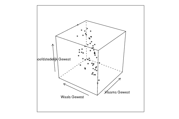
bitmap(file='cloud1.png')
cloud(z~x*y, screen = list(x=-45, y=45, z=35),xlab=par5,ylab=par6,zlab=par7)
dev.off()
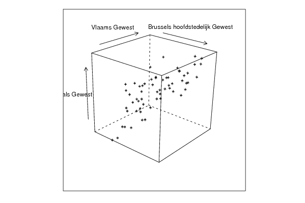
bitmap(file='cloud2.png')
cloud(z~x*y, screen = list(x=35, y=45, z=25),xlab=par5,ylab=par6,zlab=par7)
dev.off()
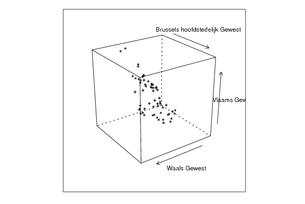
bitmap(file='cloud3.png')
cloud(z~x*y, screen = list(x=35, y=-25, z=90),xlab=par5,ylab=par6,zlab=par7)
dev.off()
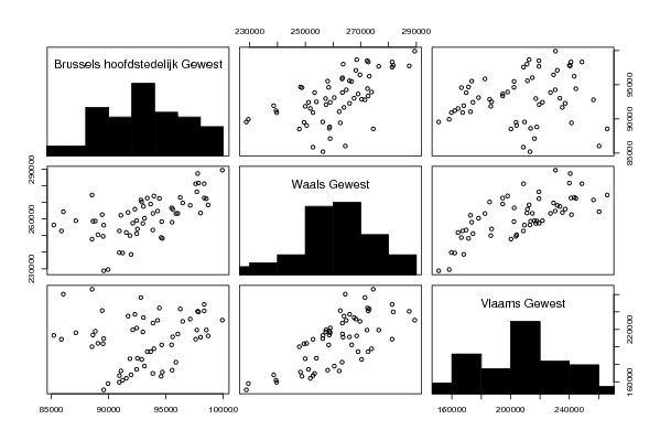
bitmap(file='pairs.png')
pairs(d,diag.panel=panel.hist)
dev.off()
x <- as.vector(x)
y <- as.vector(y)
z <- as.vector(z)
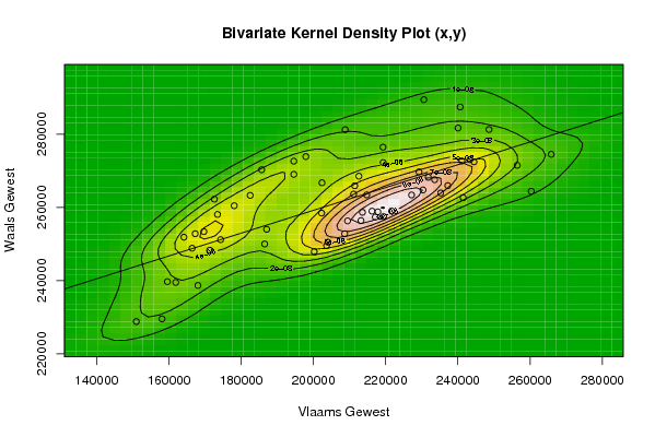
bitmap(file='bidensity1.png')
op <- KernSur(x,y, xgridsize=par1, ygridsize=par2, correlation=cor(x,y), xbandwidth=dpik(x), ybandwidth=dpik(y))
image(op$xords, op$yords, op$zden, col=terrain.colors(100), axes=TRUE,main='Bivariate Kernel Density Plot (x,y)',xlab=par5,ylab=par6)
if (par3=='Y') contour(op$xords, op$yords, op$zden, add=TRUE)
if (par4=='Y') points(x,y)
(r<-lm(y ~ x))
abline(r)
box()
dev.off()
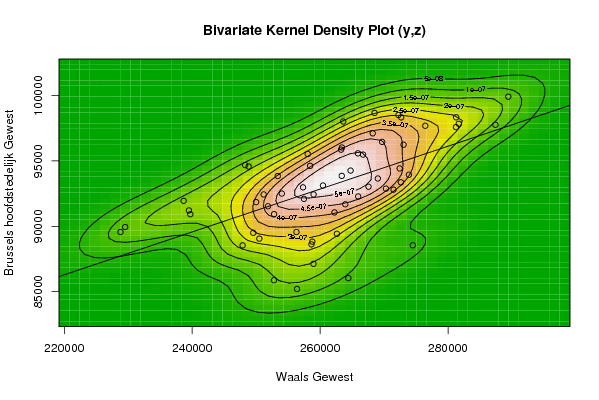
bitmap(file='bidensity2.png')
op <- KernSur(y,z, xgridsize=par1, ygridsize=par2, correlation=cor(y,z), xbandwidth=dpik(y), ybandwidth=dpik(z))
op
image(op$xords, op$yords, op$zden, col=terrain.colors(100), axes=TRUE,main='Bivariate Kernel Density Plot (y,z)',xlab=par6,ylab=par7)
if (par3=='Y') contour(op$xords, op$yords, op$zden, add=TRUE)
if (par4=='Y') points(y,z)
(r<-lm(z ~ y))
abline(r)
box()
dev.off()
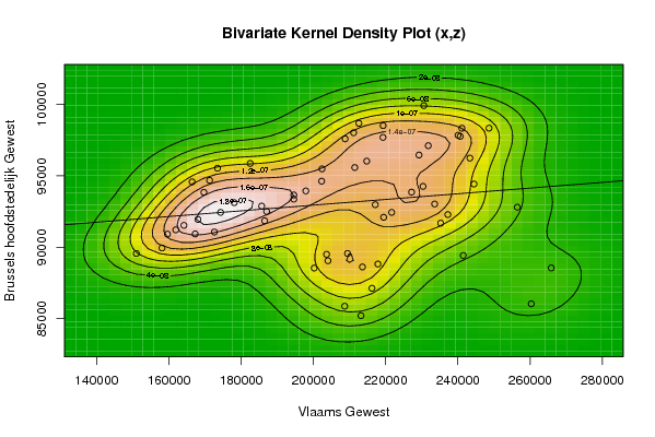
bitmap(file='bidensity3.png')
op <- KernSur(x,z, xgridsize=par1, ygridsize=par2, correlation=cor(x,z), xbandwidth=dpik(x), ybandwidth=dpik(z))
op
image(op$xords, op$yords, op$zden, col=terrain.colors(100), axes=TRUE,main='Bivariate Kernel Density Plot (x,z)',xlab=par5,ylab=par7)
if (par3=='Y') contour(op$xords, op$yords, op$zden, add=TRUE)
if (par4=='Y') points(x,z)
(r<-lm(z ~ x))
abline(r)
box()
dev.off()